Actually, it was from a photo of the original cup without added sections below.Craig, when I look at your wonderful drawings, it hurts my eyes looking at your just horrible cup. I think you've just had converted a silhouette, because there were a lot of pixel errorsI took the liberty to look at America's Cup's official homepage and made this for you

1) Thought about converting the current sail emblem but didn't. I figured that Oracle and the America's Cup organization might be pissy about copyright.
2) It's possible that the pixel errors stemmed from conversion from Corel at 600dpi to MS Paint at 96dpi. I also scaled down my artwork so it took up less space on the Template to fit X-sections. That chewed up the artwork as well. Some of the errors are actually decorative curvy bits on the cup. Looking at your artwork they won't be missed.
Thanks for the new trophy!
Redondo:
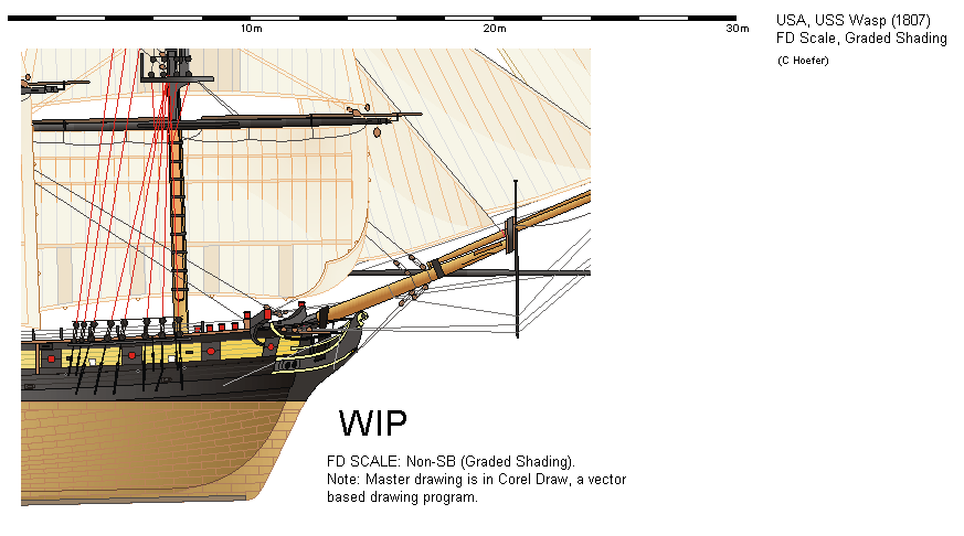
It's brutal drawing sails this detailed for sure!


